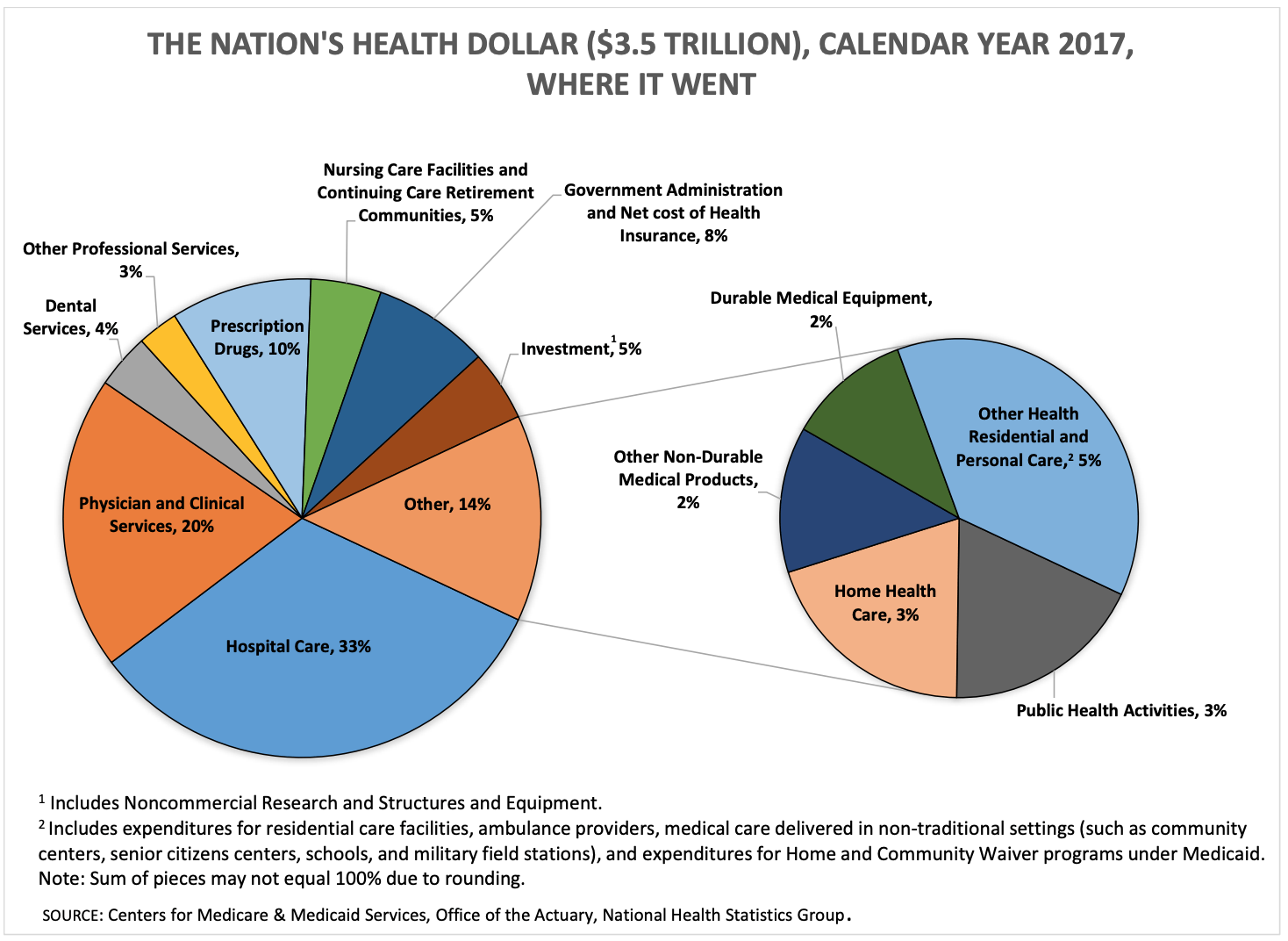
In 2017, the US spent $3.5 trillion or about 20% of GDP on health care. These charts from the Center for Medicare and Medicaid Services explain there that money came from and how it was spent.
 Pie chart showing the sources of US healthcare spending in 2017.
Pie charts showing how US healthcare dollars were spent in 2017.
The Nation’s Health Dollar 2017: Where it Came From and Where it Went